TODAY IS
Latest topics
LIVE TRAFFIC FEED
EVERY NEIGHBORHOOD IN AMERICA MAPPED TO SHOW RISK LEVELS OF LEAD CONTAMINATION IN THE WATER SUPPLY
END TIME NEWS, A CALL FOR REPENTANCE, YESHUA THE ONLY WAY TO HEAVEN :: CHRISTIANS FOR YESHUA (JESUS) :: CONTAMINATION, RADIATION LEAKS, CHEMICAL WARFARE
Page 1 of 1
 EVERY NEIGHBORHOOD IN AMERICA MAPPED TO SHOW RISK LEVELS OF LEAD CONTAMINATION IN THE WATER SUPPLY
Every neighborhood in America mapped to show risk levels of lead contamination in the water supply
Friday, August 19, 2016 by: Natural News Editors
Tags: lead contamination, water supply, American cities
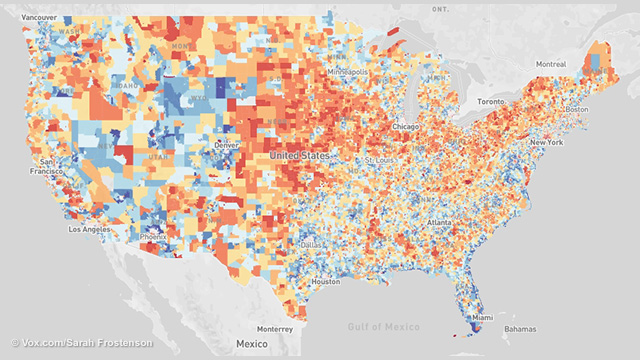
(NaturalNews) Neighborhoods where kids face the highest risk of lead poisoning exist all across America.
The trouble is that exposure risk is surprisingly difficult estimate, due to a variety of state-by-state differences in reporting standards. So we worked with epidemiologists in Washington state to estimate risk levels in every geographic area in America.
(Article by Sarah Frostenson and Sarah Kliff, republished from http://www.vox.com)
"As a parent, I found it very alarming," says Holly Davies, who works in Washington's Department of Ecology on lead exposure reduction. "My son was born in West Virginia, and there it was standard practice that at one year they get screened [for lead poisoning risk]. But here it wasn't a standard thing; I was the one who had to bring it up."
The map you'll see below shows the risk of lead exposure across the United States. The areas where kids are at highest risk of lead exposure — an estimate calculated using government data about the surroundings — are scattered all across the country.
These are the bright red areas in the map you see below — the places that public health researchers have identified as having the highest risk of lead exposure. You can see that the vast majority cluster in urban areas.
Where is the lead exposure risk in your community?
Vox worked with the Washington State Department of Health to map lead exposure risk nationally by census tract. We used housing and poverty data in our calculations to show areas of risk. These are not confirmed lead poisoning cases. (For interactive map of America please visit: http://www.vox.com/a/lead-exposure-risk-map)
In some of America's oldest and largest urban areas, places like New York and Chicago, one in five census tracts — geographic areas that usually have between 1,200 and 8,000 people — have very high risks of lead exposure. (We use a scale of one to 10 we use in the map above; these areas rank as a 10.)
In younger metro areas, like Los Angeles, risks are smaller but still present; 12 percent of census tracts there have risk scores of 10. And it's important to remember that public health experts say no level of lead exposure is safe for children.
How we created this map
Our map uses a methodology that Washington State's Department of Health pioneered earlier this year to estimate kids' risk of lead exposure in different neighborhoods. Their mission was to determine how to focus scarce public health dollars on the kids most at risk of being poisoned by lead. We worked with one of the chief epidemiologists who created the map, Rad Cunningham, to replicate the state's methodology nationally and apply it to all 72,241 census tracts in the United States.
The idea wasn't just to treat lead poisoning — the effects of lead exposure are often irreversible — but rather to use mapping tools to prevent exposure from happening in the first place.
To do this, researchers in Washington combed through the literature on lead poisoning to understand what factors best correlate with risk. They found that there were two — the age of the houses (which predicts the likelihood of lead paint) and poverty — that the literature consistently finds to be correlated with more kids coming into contact with lead.
"It's an extremely valuable tool," says Surili Patel, who is the American Public Health Association's senior program manager for environmental health. She has worked with Washington state, but not on this map. "I can see this helping the medical community and communities at risk understand where they are and why to pay attention."
Rob Walker, a public health official in Iowa who chairs the Center for Disease Control's working group on Environmental Health Tracking said that Washington's map uses "the best data available and a sound methodology" to create the risk scores.
Why it took so long to come up with a map like this
It can be frustratingly difficult — sometimes impossible — for a parent or even a public health researcher to find good data on where the risks of lead exposure are highest.
"We don't really know where the problem is; we don't know where to target our resources to protect kids," Bruce Lanphear, a professor at Simon Fraser University in Vancouver who studies the effects of low-level lead exposure in children, recently told Vox.
Cities and states aren't required to report data on how many kids have lead poisoning, or to even test all children for exposure. Flint's crisis earlier this year was unusually visual because of the unmistakable rust coloring the water, but lead normally isn't the type of toxin you can smell, see, or taste. It's different from secondhand smoke or air pollution in that it is invisible.
In lieu of consistent reporting standards, the country gets left with a hodgepodge of data. Different states have different standards; for example, because Washington and neighboring Oregon or Idaho have different standards for which kids they screen, it's difficult to compare lead exposure risk levels.
"You get to compare side by side, an apples-to-apples understanding," Patel of the APHA says of the national map. "It goes to the bigger picture of getting uniform data."
Urban areas have greater concentrations of risk, especially old industrial cities
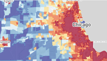
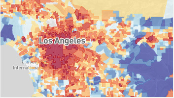
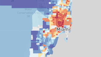
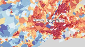
(Older industrial cities like New York and Chicago have a large percentage of areas with risk scores of 10. In New York City, 20 percent of areas have a risk of 10 and in Chicago, 23 percent of areas. But cities like Los Angeles and Miami have significantly fewer areas at risk. In Los Angeles, only 12 percent of areas have a risk of 10 and in Miami, only 2 percent.)
States that do very little testing might show very few lead poisoning cases — which can create the appearance of safety but actually reflects a lack of data. Washington, for example, has had historically low levels of lead screening with only about 1 percent of all children there getting tested.
Cunningham and his colleagues built a map meant to show both parents and health providers the places where they should be most concerned about the possibility of kids experiencing lead exposure.
"The ultimate goal is to make sure we're testing the kids who need to be tested," Elisabeth Long, also an epidemiologist with Washington, says. "This helps us start taking public health actions, and prevent other kids from exposure."
Knowing about high-risk areas is important. But what are the side effects of knowing?
There are certain challenges that come along with discussing lead risk — and that might explain why it's an area that health departments have not approached aggressively.
One is that high-risk scores don't correlate perfectly with an individual's chance of exposure. There are kids who live in the high-risk areas who might be just fine — they might live in a brand new house, for example — and children in low-risk areas who could still be harmed by exposure to lead.
"It's a hard message when you're talking about lead exposure," Long says. "And we don't want to be alarmist, but also [we want to] give more people more information about where they live."
Sometimes health departments can be reticent to single out a specific area as "high risk," as it could pose economic harm if other families or businesses don't want to move there.
"One worry you can have is about a domino effect, where businesses may decide to pull out in high-risk areas or real estate prices go up in the lower-risk areas," APHA's Patel says. She still thinks it's better to make this type of information public, even though it does carry some of these risks.
There are also limitations to how much epidemiologists can do to map risk. There are other factors that studies have associated with lead risk — whether there has historically been a local lead smelting plant, for example. But this map doesn't take that factor into account, because the data on where those plants are isn't as robust as data on poverty and housing age, which the federal government tracks closely.
While the data is relatively granular, pointing to how high the risk level in your specific geographic area might be, it still does not tell us which specific houses could expose children to lead.
"One challenge is that there is huge variability from neighborhood," says David Jacobs, chief scientist at the National Center for Healthy Housing. "What would be even more preferable is finding the exact houses where lead exists."
What this map tells us: Lead exposure risk is greatest in urban areas and less common in Western states
This map identifies the places where kids would experience the highest and lowest risks of lead poisoning. It does that by taking all 72,241 census tracts and assigning them a risk score between 1 and 10, based on how old the local houses are and the percentage of the population living in poverty.
Each grouping represents 10 percent of the total number of census tracts, so within each risk level (all the dark blue census tracts with a 1, for example) there is some variation. But what this map does especially well, as Cunningham explained, is identify the hotspots for lead exposure.
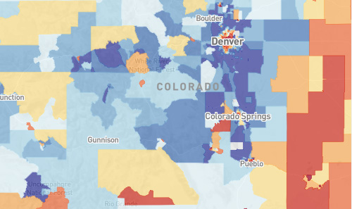
(Western states like Colorado have a greater percentage of areas with lower exposure to lead than states like Pennsylvania, but urban centers like Denver have pockets of risk.)
A high risk score doesn't mean kids living there are certain to come into contact with lead or to even to become poisoned. But it does show that, given what we know about lead exposure, kids in these areas are more at risk for such contact.
Areas of the country with lower risk are typically located in less populated Western states like Nevada, Arizona, or Colorado, where more than 25 percent of the areas have a lead risk score of 1. But there are also Southern states like Florida and Texas, where more than 15 percent of the tracts have a lead risk score of 1.
On average, only 8 percent of census tracts, or geographic areas, in a state have a high risk of lead exposure. But there are four states — Rhode Island, New York, Ohio, and Pennsylvania — where more than 20 percent of the census tracts have a lead exposure risk of 10.
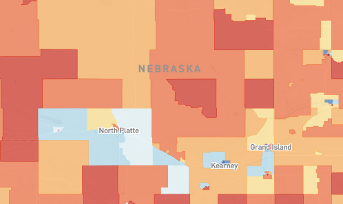
(In Nebraska, where more than a quarter of the state is rural, 92 percent of areas have a lead exposure risk of 6 or greater.)
Of the 7,224 census tracts with lead exposure risks of 10 — the highest possible risk level — the vast majority, 92 percent, are located in urban areas. In New York and Chicago, about 20 percent of census tracts have the highest risk score.
Risks can be higher in some smaller cities, too. In small metro areas with populations under 2 million like Cleveland, Ohio, and Milwaukee, Wisconsin, more than 30 percent of all census tracts have a high risk of lead exposure. Even smaller cities with populations under 150,000 like New Bedford, Massachusetts, and Utica, New York, have high risks of lead exposure, with more than 40 percent of all census tracts at extreme risk.
There are also rural areas with high risks of lead exposure. While only 17 rural tracts have a lead exposure risk of 10, the highest risk, 55 percent of rural areas have lead exposure risk levels of 6 or greater. Some states with large percentages of rural census tracts, like Kansas and Nebraska, have large swaths of lead exposure risks. In Nebraska, 92 percent of rural areas have a lead risk exposure score of 6 or greater.
Read more at: http://www.vox.com
Sources:
[1] http://www.vox.com
[2] http://www.nytimes.com
[3] http://www.ncbi.nlm.nih.gov/pmc/articles/PMC1241046/
[4] http://www.vox.com
[5] http://www.vox.com/2016/1/21/10811004/lead-poisoning-cities-us
Learn more: http://www.naturalnews.com/055024_lead_contamination_water_supply_American_cities.html#ixzz4Hu1CVwql
Friday, August 19, 2016 by: Natural News Editors
Tags: lead contamination, water supply, American cities

(NaturalNews) Neighborhoods where kids face the highest risk of lead poisoning exist all across America.
The trouble is that exposure risk is surprisingly difficult estimate, due to a variety of state-by-state differences in reporting standards. So we worked with epidemiologists in Washington state to estimate risk levels in every geographic area in America.
(Article by Sarah Frostenson and Sarah Kliff, republished from http://www.vox.com)
"As a parent, I found it very alarming," says Holly Davies, who works in Washington's Department of Ecology on lead exposure reduction. "My son was born in West Virginia, and there it was standard practice that at one year they get screened [for lead poisoning risk]. But here it wasn't a standard thing; I was the one who had to bring it up."
The map you'll see below shows the risk of lead exposure across the United States. The areas where kids are at highest risk of lead exposure — an estimate calculated using government data about the surroundings — are scattered all across the country.
These are the bright red areas in the map you see below — the places that public health researchers have identified as having the highest risk of lead exposure. You can see that the vast majority cluster in urban areas.
Where is the lead exposure risk in your community?
Vox worked with the Washington State Department of Health to map lead exposure risk nationally by census tract. We used housing and poverty data in our calculations to show areas of risk. These are not confirmed lead poisoning cases. (For interactive map of America please visit: http://www.vox.com/a/lead-exposure-risk-map)
In some of America's oldest and largest urban areas, places like New York and Chicago, one in five census tracts — geographic areas that usually have between 1,200 and 8,000 people — have very high risks of lead exposure. (We use a scale of one to 10 we use in the map above; these areas rank as a 10.)
In younger metro areas, like Los Angeles, risks are smaller but still present; 12 percent of census tracts there have risk scores of 10. And it's important to remember that public health experts say no level of lead exposure is safe for children.
How we created this map
Our map uses a methodology that Washington State's Department of Health pioneered earlier this year to estimate kids' risk of lead exposure in different neighborhoods. Their mission was to determine how to focus scarce public health dollars on the kids most at risk of being poisoned by lead. We worked with one of the chief epidemiologists who created the map, Rad Cunningham, to replicate the state's methodology nationally and apply it to all 72,241 census tracts in the United States.
The idea wasn't just to treat lead poisoning — the effects of lead exposure are often irreversible — but rather to use mapping tools to prevent exposure from happening in the first place.
To do this, researchers in Washington combed through the literature on lead poisoning to understand what factors best correlate with risk. They found that there were two — the age of the houses (which predicts the likelihood of lead paint) and poverty — that the literature consistently finds to be correlated with more kids coming into contact with lead.
"It's an extremely valuable tool," says Surili Patel, who is the American Public Health Association's senior program manager for environmental health. She has worked with Washington state, but not on this map. "I can see this helping the medical community and communities at risk understand where they are and why to pay attention."
Rob Walker, a public health official in Iowa who chairs the Center for Disease Control's working group on Environmental Health Tracking said that Washington's map uses "the best data available and a sound methodology" to create the risk scores.
Why it took so long to come up with a map like this
It can be frustratingly difficult — sometimes impossible — for a parent or even a public health researcher to find good data on where the risks of lead exposure are highest.
"We don't really know where the problem is; we don't know where to target our resources to protect kids," Bruce Lanphear, a professor at Simon Fraser University in Vancouver who studies the effects of low-level lead exposure in children, recently told Vox.
Cities and states aren't required to report data on how many kids have lead poisoning, or to even test all children for exposure. Flint's crisis earlier this year was unusually visual because of the unmistakable rust coloring the water, but lead normally isn't the type of toxin you can smell, see, or taste. It's different from secondhand smoke or air pollution in that it is invisible.
In lieu of consistent reporting standards, the country gets left with a hodgepodge of data. Different states have different standards; for example, because Washington and neighboring Oregon or Idaho have different standards for which kids they screen, it's difficult to compare lead exposure risk levels.
"You get to compare side by side, an apples-to-apples understanding," Patel of the APHA says of the national map. "It goes to the bigger picture of getting uniform data."
Urban areas have greater concentrations of risk, especially old industrial cities


(Older industrial cities like New York and Chicago have a large percentage of areas with risk scores of 10. In New York City, 20 percent of areas have a risk of 10 and in Chicago, 23 percent of areas. But cities like Los Angeles and Miami have significantly fewer areas at risk. In Los Angeles, only 12 percent of areas have a risk of 10 and in Miami, only 2 percent.)
States that do very little testing might show very few lead poisoning cases — which can create the appearance of safety but actually reflects a lack of data. Washington, for example, has had historically low levels of lead screening with only about 1 percent of all children there getting tested.
Cunningham and his colleagues built a map meant to show both parents and health providers the places where they should be most concerned about the possibility of kids experiencing lead exposure.
"The ultimate goal is to make sure we're testing the kids who need to be tested," Elisabeth Long, also an epidemiologist with Washington, says. "This helps us start taking public health actions, and prevent other kids from exposure."
Knowing about high-risk areas is important. But what are the side effects of knowing?
There are certain challenges that come along with discussing lead risk — and that might explain why it's an area that health departments have not approached aggressively.
One is that high-risk scores don't correlate perfectly with an individual's chance of exposure. There are kids who live in the high-risk areas who might be just fine — they might live in a brand new house, for example — and children in low-risk areas who could still be harmed by exposure to lead.
"It's a hard message when you're talking about lead exposure," Long says. "And we don't want to be alarmist, but also [we want to] give more people more information about where they live."
Sometimes health departments can be reticent to single out a specific area as "high risk," as it could pose economic harm if other families or businesses don't want to move there.
"One worry you can have is about a domino effect, where businesses may decide to pull out in high-risk areas or real estate prices go up in the lower-risk areas," APHA's Patel says. She still thinks it's better to make this type of information public, even though it does carry some of these risks.
There are also limitations to how much epidemiologists can do to map risk. There are other factors that studies have associated with lead risk — whether there has historically been a local lead smelting plant, for example. But this map doesn't take that factor into account, because the data on where those plants are isn't as robust as data on poverty and housing age, which the federal government tracks closely.
While the data is relatively granular, pointing to how high the risk level in your specific geographic area might be, it still does not tell us which specific houses could expose children to lead.
"One challenge is that there is huge variability from neighborhood," says David Jacobs, chief scientist at the National Center for Healthy Housing. "What would be even more preferable is finding the exact houses where lead exists."
What this map tells us: Lead exposure risk is greatest in urban areas and less common in Western states
This map identifies the places where kids would experience the highest and lowest risks of lead poisoning. It does that by taking all 72,241 census tracts and assigning them a risk score between 1 and 10, based on how old the local houses are and the percentage of the population living in poverty.
Each grouping represents 10 percent of the total number of census tracts, so within each risk level (all the dark blue census tracts with a 1, for example) there is some variation. But what this map does especially well, as Cunningham explained, is identify the hotspots for lead exposure.

(Western states like Colorado have a greater percentage of areas with lower exposure to lead than states like Pennsylvania, but urban centers like Denver have pockets of risk.)
A high risk score doesn't mean kids living there are certain to come into contact with lead or to even to become poisoned. But it does show that, given what we know about lead exposure, kids in these areas are more at risk for such contact.
Areas of the country with lower risk are typically located in less populated Western states like Nevada, Arizona, or Colorado, where more than 25 percent of the areas have a lead risk score of 1. But there are also Southern states like Florida and Texas, where more than 15 percent of the tracts have a lead risk score of 1.
On average, only 8 percent of census tracts, or geographic areas, in a state have a high risk of lead exposure. But there are four states — Rhode Island, New York, Ohio, and Pennsylvania — where more than 20 percent of the census tracts have a lead exposure risk of 10.

(In Nebraska, where more than a quarter of the state is rural, 92 percent of areas have a lead exposure risk of 6 or greater.)
Of the 7,224 census tracts with lead exposure risks of 10 — the highest possible risk level — the vast majority, 92 percent, are located in urban areas. In New York and Chicago, about 20 percent of census tracts have the highest risk score.
Risks can be higher in some smaller cities, too. In small metro areas with populations under 2 million like Cleveland, Ohio, and Milwaukee, Wisconsin, more than 30 percent of all census tracts have a high risk of lead exposure. Even smaller cities with populations under 150,000 like New Bedford, Massachusetts, and Utica, New York, have high risks of lead exposure, with more than 40 percent of all census tracts at extreme risk.
There are also rural areas with high risks of lead exposure. While only 17 rural tracts have a lead exposure risk of 10, the highest risk, 55 percent of rural areas have lead exposure risk levels of 6 or greater. Some states with large percentages of rural census tracts, like Kansas and Nebraska, have large swaths of lead exposure risks. In Nebraska, 92 percent of rural areas have a lead risk exposure score of 6 or greater.
Read more at: http://www.vox.com
Sources:
[1] http://www.vox.com
[2] http://www.nytimes.com
[3] http://www.ncbi.nlm.nih.gov/pmc/articles/PMC1241046/
[4] http://www.vox.com
[5] http://www.vox.com/2016/1/21/10811004/lead-poisoning-cities-us
Learn more: http://www.naturalnews.com/055024_lead_contamination_water_supply_American_cities.html#ixzz4Hu1CVwql

Ara- Admin

- Join date : 2011-01-19
Location : USA
 Similar topics
» EPA WASTED 12 YEARS IGNORING DANGEROUS LEAD CONTAMINATION AROUND HUNDREDS OF ABANDONED SMELTING SITES
» DAHBOO 77 - OROVILLE'S NEW GOLD RUSH, DAM FACES EARTHQUAKE RISK FROM RIPID RISE IN WATER LEVELS
» "WE'RE USING KIDS AS LEAD DETECTORS": 6 CITIES IN MICHIGAN HAVE EVEN HIGHER LEVELS OF LEAD THAN FLINT
» FLINT, MICHIGAN, STILL HARASSING PUBLIC WITH PAST DUE WATER BILLS EVEN THOUGH WATER IS CONTAMINATED WITH TOXIC LEAD
» EPA SPENDS NEARLY $300K TO TRACK ENERGY AND WATER USE OF OFFICE WORKERS WHILE DOING NOTHING ABOUT CHILDREN DRINKING LEAD-LACED WATER
END TIME NEWS, A CALL FOR REPENTANCE, YESHUA THE ONLY WAY TO HEAVEN :: CHRISTIANS FOR YESHUA (JESUS) :: CONTAMINATION, RADIATION LEAKS, CHEMICAL WARFARE
Page 1 of 1
Permissions in this forum:
You cannot reply to topics in this forum
 Sun 29 Aug 2021, 22:15 by Jude